Toshy x Satelliet Originals
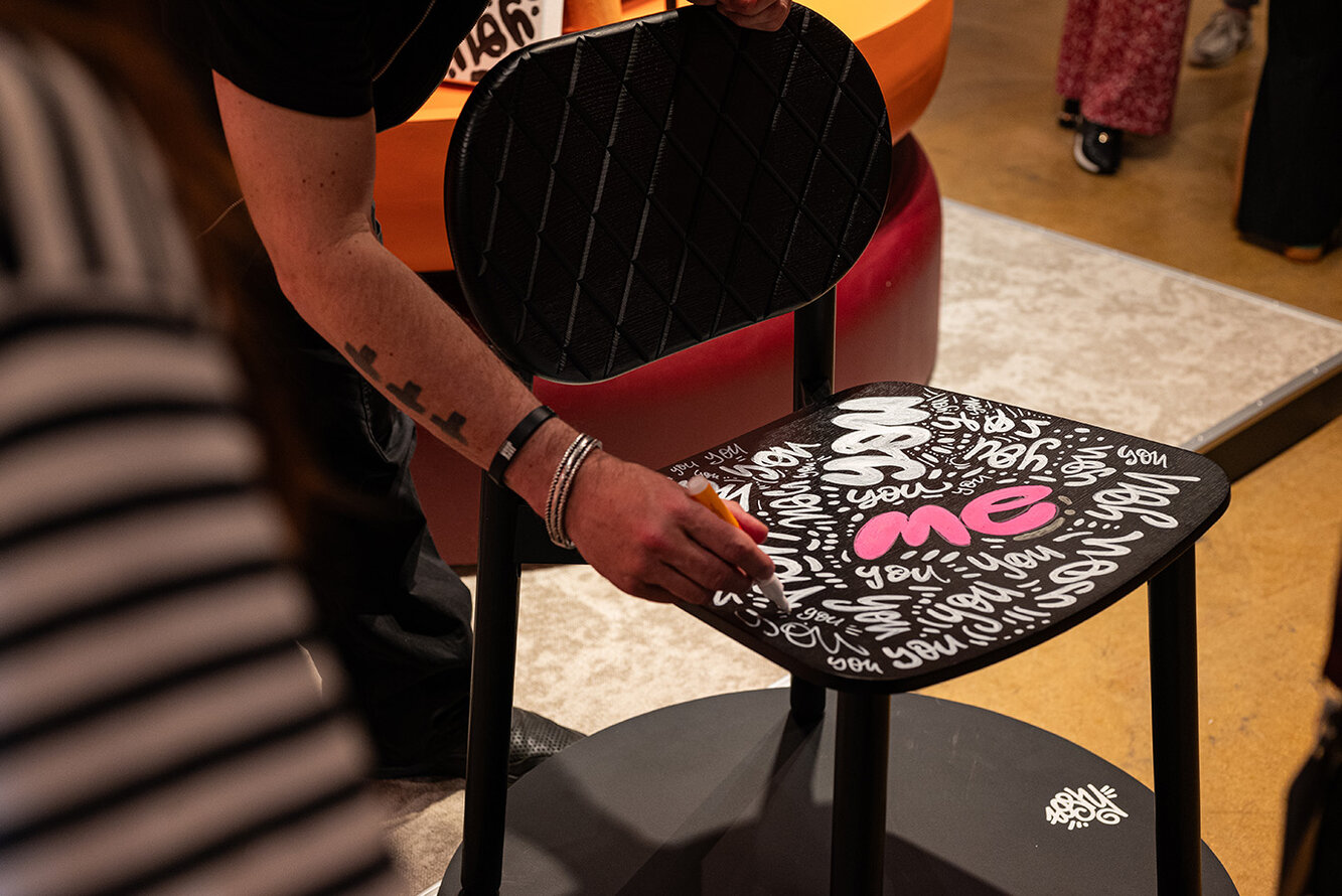
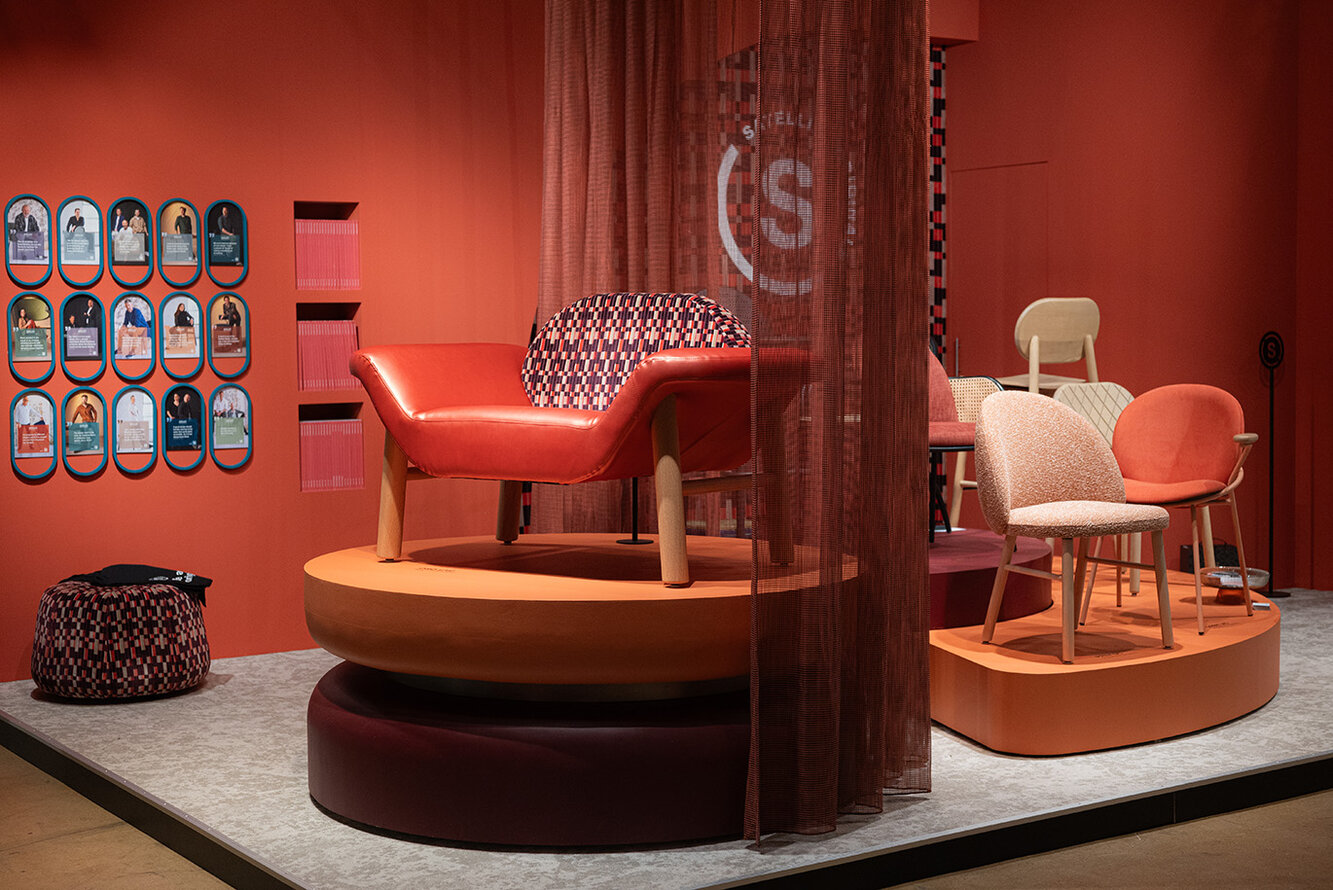
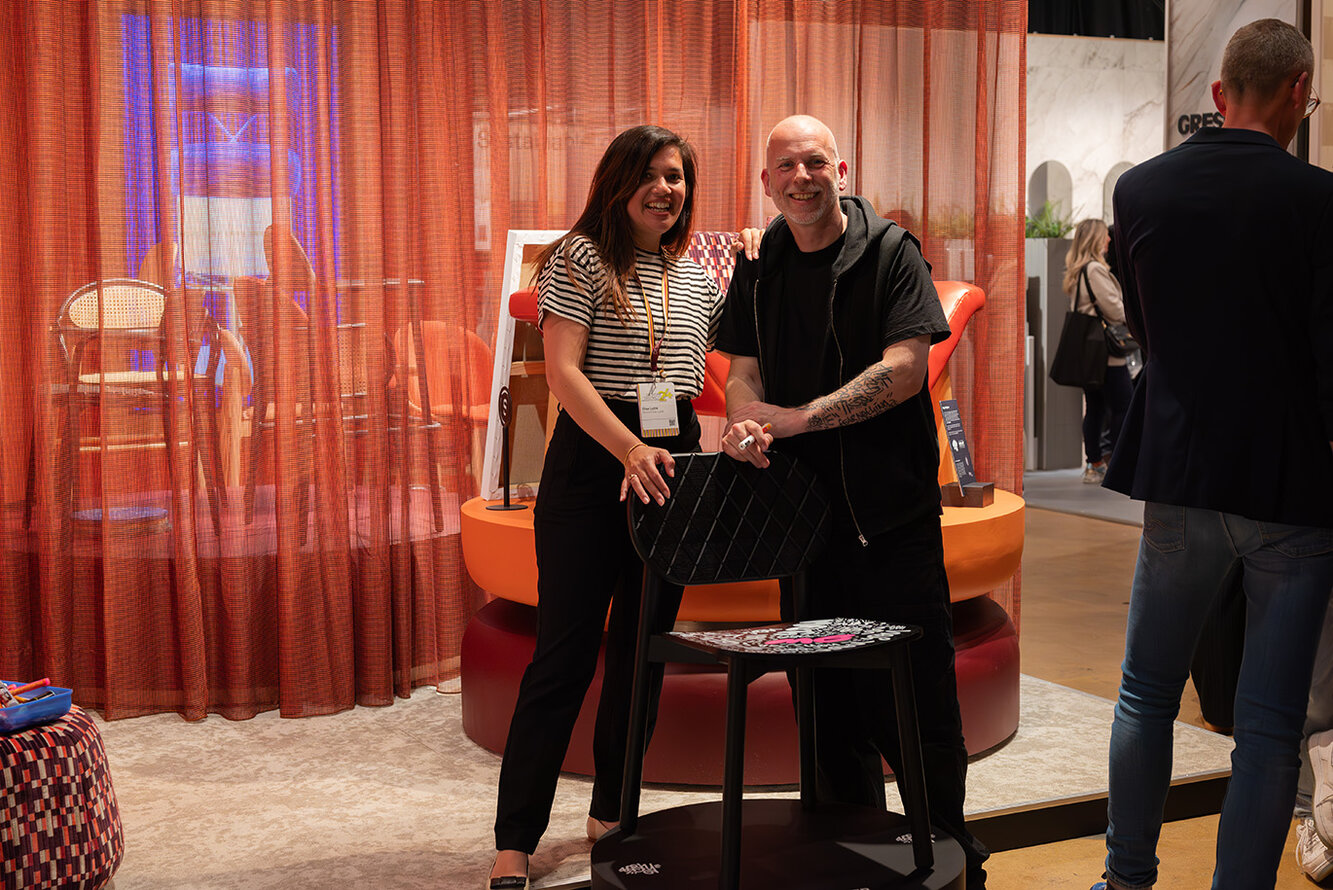
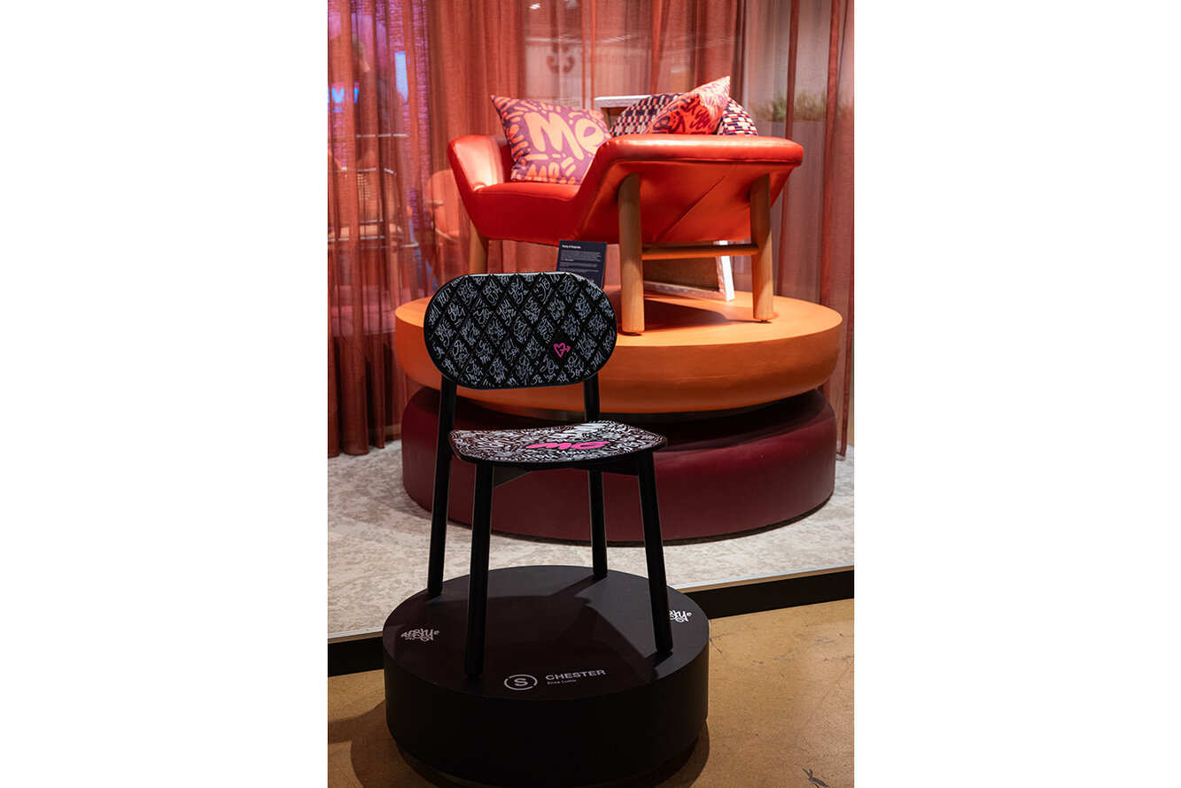
Satelliet Originals draws inspiration from unique talents with original stories. The (inter)national artist and designer Toshy is the embodiment of the brand statement and a source of inspiration. As part of the collab, he provided a creative ‘live painting’ session on the stand. Designer Elise Luttik's iconic Chester chair served as the canvas for Toshy's Originals concept: You & Me.
Authentic and original
‘You & Me is all about recognising and appreciating unique individuality,’ Toshy enthuses. ‘The interaction between different individuals provides inspiration and connection. By staying close to yourself and thus being authentic and original, you show your true character and make a difference. Toshy's You & Me concept ties in with Satelliet Originals' brand message: ‘Be an original.’ During the live painting, Toshy repeatedly painted the word ‘You’ and once the word ‘Me’ on the Chester. ‘This artwork illustrates that a chair is functional by itself (Me), but gains its connecting value when a second chair is added and interacts with You. That's the touch of hospitality that is so characteristic of Satelliet Originals.’
Communicating with street art
Besides live painting for all visitors, Toshy provided an exclusive presentation for invited guests and took the select company on an inspiring journey through his unique, artistic world. It reads like an exciting book: ‘From underground graffiti sprayer to influential lifestyle brand.’ His story begins in 1985, inspired by the documentary Style Wars in New York, he decided to use the public environment as his canvas. Using illegally obtained spray cans, he tagged and painted blind walls. A means of demarcating territory and giving free rein to his rebellious side. ‘Graffiti for me was not just a form of street art, I used the wall as a means of communication.’
From Trash to King
The name Toshy, means ‘mess’ in street slang and reflects his background and creative style. Toshy's work is infused with messages and humour, inspired by the colourful subcultures of the 1980s and iconic artists such as Keith Haring. ‘The work of photographers like Peter Lindbergh and Helmut Newton, and artists like Jeff Koons and his muse Cicciolina who manage to amaze people, are also an endless source of inspiration.’
Graffiti became mainstream and Toshy received official commissions. ‘This made me miss the original charm of my work and the excitement of working secretly, illegally in the dead of night.’ The advertising world offered a new outlet. For his free artworks, Toshy drew inspiration from pop culture with icons such as Madonna, George Michael and Michael Jackson. Street art was transformed into abstract artworks with deeper meaning. Personal text and a message became his trademark. Toshy iconises ‘ordinary’ people and uses symbols like an anchor, heart and flower to motivate others to embrace the highlights in their lives. With ‘Love Now’ and ‘Connecting hearts’, he brings a universal message of love and connection. Toshy's work continues to evolve, but he is true to his core: a creative, rebellious spirit telling stories through art.
What else did we see?
Some highlights at Design District: colourful and experimental designs. Showcasing colourful trends, the trade fair in Rotterdam brought a fresh and vibrant atmosphere. Visitors were immersed in a palette that ranged from bright hues to pastel colours, with a particular hint of retro shades such as neon pink and lots of yellow. These colours created an energetic and playful atmosphere.
Besides colour, a strong play was seen with designs and shapes. Designers experimented with various patterns and playful shapes, giving each object a unique character. Natural materials such as wood, wool and felt were also frequently used, giving a sense of warmth and authenticity. The designs also focused on sound and stimulation. Not only through wall panels, but also by integrating sound-absorbing elements in lamps, for example. These innovations contribute to a calm and serene environment.
A striking visual element is the ‘framing’ of objects. This was visible in several ways: in the use of piping and tubes to frame fabrics. That which is framed, framed provides a sense of hold and structure.
Want to see more from Satelliet Originals x Toshy? Check out the inspiring aftermovie below.
